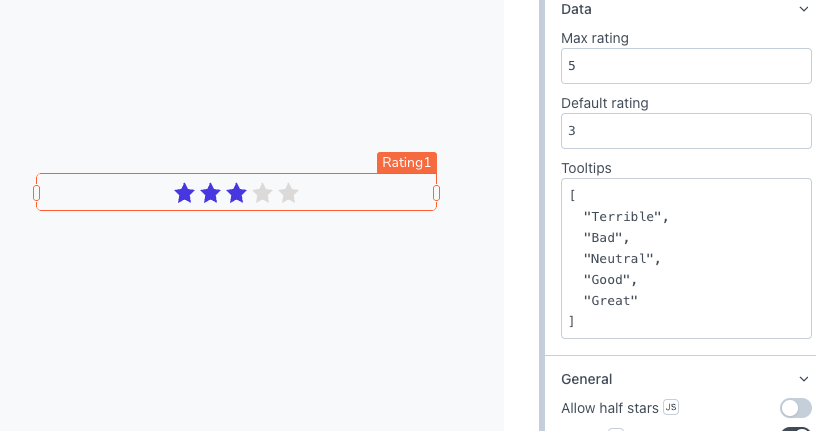
Rating
This page provides information on using the Rating widget to perform a quick rating operations.

Content properties
These properties are customizable options present in the property pane of the widget, allowing users to modify the widget according to their preferences.
Data
Max Rating number
Specify the total number of stars you want to use for rating the information. The default value is set to 5.
Default Rating number
Sets the default value of the widget when users see it for the first time. The default value is set to 3.
Tooltips array<string>
Sets the tooltip content for the stars by providing an array of strings that describe the values of each star.
Expected data structure:
[
  "Terrible",
  "Bad",
  "Neutral",
  "Good",
  "Great"
]
General
General properties are essential configurations that provide overall control over the widget's behavior and appearance.
Allow half stars boolean
Enable this option to accept half star ratings, providing users with more precise rating capabilities.
Visible boolean
Controls the visibility of the widget. If you turn off this property, the widget would not be visible in View Mode. Additionally, you can use JavaScript by clicking on JS next to the Visible property to conditionally control the widget's visibility. Default value is set to true.
For example, if you want to make the widget visible only when the user selects "Yes" from a Select widget, you can use the following JavaScript expression:
{{Select1.selectedOptionValue === "Yes"}}
Disabled boolean
Prevents users from selecting the widget. Even though the widget remains visible, user input is not permitted. Additionally, you can use JavaScript by clicking on JS next to the Disabled property to control the widget's disabled state conditionally. Default value is set to false.
For example, if you want to allow only a specific user to click the button, you can use the following JavaScript expression:
{{appsmith.user.email=="john@appsmith.com"?false:true}}
Read Only boolean
When enabled, user input is disabled, but the stars retain their regular styling, and the tooltips remain visible when the user hovers with the mouse cursor. However, when the Disabled setting is turned on, the Read Only mode is disregarded.
Animate Loading boolean
Controls whether the widget is displayed with a loading animation. When enabled, the widget shows a skeletal animation during the loading process. Additionally, you can control it through JavaScript by clicking on the JS next to the property. Default value is set to true.
Height string
This property determines how the widget's height adjusts to changes in its content. There are three available options:
- Fixed: Maintains a constant height for the widget, allowing you to adjust it by dragging or using the resize handle.
- Auto Height: The widget's height adjusts dynamically in response to changes in its content.
- Auto Height with limits: Same as Auto height, with a configurable option to set the minimum and maximum number of rows the widget can occupy.
Events
Events are properties that allow you to define actions or responses based on user interactions or widget state changes.
onChange
Sets the action (Framework functions, queries, or JS functions) to be executed when the rate is changed.
Style properties
Style properties allow you to change the look and feel of the widget.
General
General properties are essential configurations that provide overall control over the widget's behavior and appearance.
Star size string
Allows you to control the size of the star icons.
Options:
- Small
- Medium
- Large
Color
Active color string
Sets the color of the stars that are displayed for the default rate. Additionally, the active color can be programmatically modified using JavaScript functions.
Inactive color string
Sets the color of inactive stars displayed in the rating widget. Additionally, the inactive color can be programmatically modified using JavaScript functions.
Reference properties
Reference properties are properties that are not available in the property pane but can be accessed using the dot operator in other widgets or JavaScript functions. They provide additional information or allow interaction with the widget programmatically. For instance, to get the visibility status, you can use Rating1.isVisible.
isVisible boolean
Reflects whether the widget is visible or not.
Example:
{{Rating1.isVisible}}
maxCount number
Indicates the total number of stars, as specified in the Max Rating property.
Example:
{{Rating1.maxCount}}
value number
Indicates the value selected by the user in the Rating widget.
Example:
{{Rating1.value}}
Methods
The methods provided by the widget allow users to dynamically update and manipulate its properties, facilitating the creation of dynamic and interactive applications without the need for manual property modifications.
These methods are asynchronous and return a Promise. You can use the .then() block to ensure execution and sequencing of subsequent lines of code in Appsmith.
setVisibility (param: boolean): Promise
Sets the visibility of the widget.
Example:
Rating1.setVisibility(true)
setDisabled (param: boolean): Promise
Sets the disabled state of the widget.
Example:
Rating1.setDisabled(false)
setValue (param: number): Promise
Allows you to dynamically set the value of the widget.
Example:
Rating1.setValue(3)
See also
- Insert Data – Learn how to insert data into a datasource using widgets.
- Update Data – Discover how to update data using widgets.
- Form – Learn more about the Form widget.
- Modal - Learn more about the Modal widget.