Inline Buttons (AI Assistant)
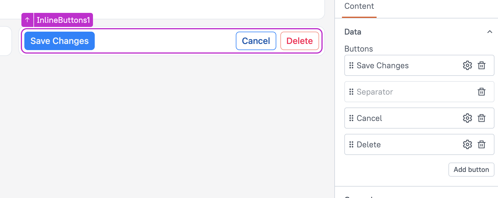
This page provides information on the Inline Buttons widget (available in AI Assistant Apps), which allows you to place multiple buttons in a single row with a customizable separator, providing a streamlined interface for user interactions.

Content properties
These properties are customizable options present in the property pane of the widget, allowing users to modify the widget according to their preferences.
Data
Defines the options and datasources for the widget, determining the content displayed to users.
Buttons
This property allows you to define the buttons within the Inline Buttons widget. You can add multiple buttons, remove them, or rearrange them to customize the widget's layout based on your needs.
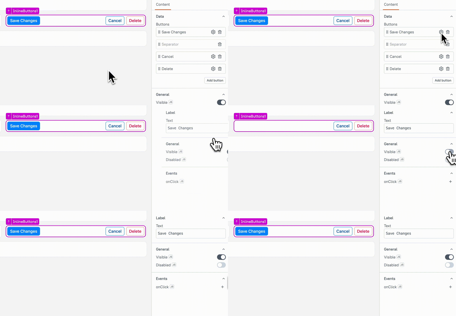
Each button is configured individually, and you can edit its label, action, and style by clicking the gear icon next to the button.For more details, see Button Settings.
By default, a Separator is included between button groups to visually distinguish them. The separator can be removed or repositioned, but only one separator is allowed in the widget at a time. If you need multiple separators, you can use the Toolbar widget.
Visible boolean
This property controls the visibility of the widget. If you turn off this property, the widget would not be visible in view mode. Additionally, you can use JavaScript by clicking on JS next to the Visible property to conditionally control the widget's visibility.
For example, if you want to make the widget visible only when the user selects "Yes" from a Select widget, you can use the following JavaScript expression:
{{Select1.selectedOptionValue === "Yes"}}
Animate Loading boolean
This property controls whether the widget is displayed with a loading animation. When enabled, the widget shows a skeletal animation during the loading process. Additionally, you can control it through JavaScript by clicking on the JS next to the property.
Buttons Settings
This property allows you to configure individual buttons within the group. By clicking the gear icon next to a button, you can update its label and events for that button.

Text label
Specifies the label displayed on the button.
Visible boolean
Controls the visibility of the button. When set to true, the button is displayed; when false, it is hidden.
Example: If you want to display Button only when Checkbox is checked, use:
{{Checkbox1.isChecked ? true : false}}
Disabled boolean
This property disables the specific button, preventing users from interacting with it. The button remains visible but cannot be clicked. You can use JavaScript by clicking the JS icon next to the Disabled property to conditionally control the button's disabled state.
Example:
{{appsmith.user.email=="john@appsmith.com"?false:true}}
onClick
Allows you to configure one or multiple actions (Framework functions, queries, or JS functions) to be executed when the button is clicked. You can chain multiple actions together, and all the nested actions would run simultaneously.
Style properties
Style properties allow you to customize the appearance of the button. These properties are available inside the individual button settings, enabling you to modify the button's look and feel to match your design preferences.
General
General properties are essential configurations that provide overall control over the widget's behavior and appearance.
Button variant string
Specifies the style type of the button to indicate its significance. You can choose from the following options:
Options:
- Filled: A solid button with a background color, typically used for primary actions or important buttons.
- Outlined: A button with only a border and no background, used for secondary actions or less important buttons.
- Subtle: A button with minimal styling, often used for less prominent actions, providing a cleaner and more subtle look.
- Ghost: A button with no visible border or background, ideal for actions that are even more subtle or when you want to maintain a clean, unobtrusive interface.
This property can also be dynamically set using JS, allowing you to change the button's appearance based on conditions or user interactions.
Button color string
Specifies the color of the button to emphasize its importance or action. You can select from the following predefined color options:
- Accent: Uses the accent color from the app theme. You can change the accent color from the app theme settings.
- Neutral: Uses a neutral color, which is black for light theme and white for dark theme.
- Positive: Uses a green shade to indicate positive values. The color cannot be customized.
- Negative: Uses a red shade to indicate negative values. The color cannot be customized.
- Warning: Uses an orange shade to indicate caution or warnings. The color cannot be customized.
You can enable JS to dynamically update the color. The value should be one of the predefined options such as accent, neutral, positive, negative, or warning. You cannot set a custom color directly for this widget. To change the color, you can adjust it through the app theme settings.
Icon string
Specifies the icon to be displayed on the button. You can choose from a predefined set of icons or use custom icons by specifying their name.
Position
Specifies the alignment of the button within its container. You can set it to one of the following values:
- Left: Aligns the icon to the left side of the button.
- Right: Aligns the icon to the right side of the button.
Reference properties
Reference properties are properties that are not available in the property pane but can be accessed using the dot operator in other widgets or JavaScript functions. They provide additional information or allow interaction with the widget programmatically. For instance, to get the visibility status, you can use InlineButtons1.isVisible.
isVisible boolean
Reflects whether the widget is visible or not.
Example:
{{InlineButtons1.isVisible}}
Methods
Widget property setters enable you to modify the values of widget properties at runtime, eliminating the need to manually update properties in the editor.
These methods are asynchronous and return a Promise. You can use the .then() block to ensure execution and sequencing of subsequent lines of code in Appsmith.
setVisibility (param: boolean): Promise
Sets the visibility of the widget. This method allows you to show or hide a widget based on certain conditions or user interactions.
Example:
InlineButtons1.setVisibility(true) // Makes the Heading widget visible
setDisabled (param: boolean): Promise
Sets the disabled state of the widget. When set to true, the widget becomes unresponsive, and users cannot interact with it.
Example:
InlineButtons1.setDisabled(false) // Enables the Heading widget